Introduction
This articles focuses on the process of creating a Custom Control in Silverlight 2. It describes the basics of what you need to build a styleable control with custom logic that can be used in Silverlight applications. The article shows a sample(part) of implementing a LinkLabel control that recognizes URIs in a given text and displays them as links instead of as plain text.Overview
The control model in Silverlight 2 offers creating UserControls and Custom Controls. UserControls enable encapsulation of a specific logic. They are used in scenarios where you want to reuse XAML and/or logic in multiple places or build a sophisticated page with smaller chunks(the UserControls). However, in other scenarios you may need a custom logic to be built in the control and this control to allow designers customize easily its look. You need a way to modify the control visuals without having to modify the control logic. This is where the Custom Controls comes in handy. In Silverlight they derive from the Control class and specify a default style for the way they will look like.
To get started create a Silverlight Class Library project in Visual Studio. This will generate just a single .cs file. Lets take a sample implementation of a LinkLabel control.
public class LinkLabel : Control
{
...
}
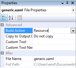
- Open the Properties window of the file.
- Change the Build Action to Resource.
- Clear the Custom Tool value.
In the generic.xaml add a ResourceDictionary element where you will put all the resources.
<ResourceDictionary xmlns="http://schemas.microsoft.com/winfx/2006/xaml/presentation"
xmlns:x="http://schemas.microsoft.com/winfx/2006/xaml">
...
</ResourceDictionary>
<ResourceDictionary xmlns="http://schemas.microsoft.com/winfx/2006/xaml/presentation"
xmlns:x="http://schemas.microsoft.com/winfx/2006/xaml"
xmlns:local="clr-namespace:CompletIT.Windows.Controls;assembly=LinkLabel">
<!-- Default style for CompletIT.Windows.Controls.LinkLabel -->
<Style TargetType="local:LinkLabel">
<Setter Property="Template">
<Setter.Value>
<ControlTemplate TargetType="local:LinkLabel">
<StackPanel x:Name="LayoutRoot">
<ContentPresenter />
</StackPanel>
</ControlTemplate>
</Setter.Value>
</Setter>
</Style>
</ResourceDictionary>
With the release of the VisualStateManager in Beta 2 it is important to point that this style is also the place where you can define the state parts of your control. This is not the main focus of this article so I won't get deep in it. For more information on this topic you can read Parts & States Model with VisualStateManager and watch Creating Rich, Dynamic User Interfaces with Silverlight 2 by Karen Corby.
Ok, enough of XAML. Lets see what's needed in the code.
Start with creating a constructor and set the FrameworkElement.DefaultStyleKey - type that should be used to look up the built-in style - to the Type of the control.
public LinkLabel()
: base()
{
DefaultStyleKey = typeof( LinkLabel );
}
public static readonly DependencyProperty TextProperty = DependencyProperty.Register(
"Text",
typeof( string ),
typeof( LinkLabel ),
new PropertyMetadata( new PropertyChangedCallback( OnTextChanged ) ) );
public string Text
{
get
{
return ( string )this.GetValue( TextProperty );
}
set
{
base.SetValue( TextProperty, value );
}
}
One last step before proceeding to the control logic code. The StackPanel we use for a "built-in" style in the generic.xaml is still not accessible from the code file. To assign it to a member variable create a private field of type StackPanel and override the OnApplyTemplate method like this:
public override void OnApplyTemplate()
{
this.layoutRoot = this.GetTemplateChild( "LayoutRoot" ) as StackPanel;
Debug.Assert( this.layoutRoot != null, "LayoutRoot is null" );
base.OnApplyTemplate();
}
That's it. From there on you should write the custom logic needed by your control to act as you want. For our LinkLabel sample we need to process the entered text by replacing all URIs with links. To achieve this we need to define a new method (ProcessText()) that should be called (1) from the OnApplyTemplate event and (2) from the OnTextChanged event. I'll skip the implementation of the ProcessText method here as I'll blog about the full implementation of the LinkLabel control later this week and will provide the source code and a sample usage.
private static void OnTextChanged( DependencyObject d, DependencyPropertyChangedEventArgs e )
{
LinkLabel linkLabel = d as LinkLabel;
Debug.Assert( linkLabel != null, "LaytouRoot is null" );
linkLabel.ProcessText();
}
Conclusion
Building a Custom Control in Silverlight can be tricky sometimes, but that really depends on the complexity the control requires. Silverlight really gives the freedom to create whatever your imagination can born and push it to the highest level. You are able to build beautiful controls that can be easily customized by designers on their own. You are sure that the designer won't brake your logic while making the fascinate look of the control. With the new VisualStateManager and the "Parts and States Model" you can easily define complex UI while keeping the designer's ability to style it. This is another quite a big and interesting topic that I'll try to cover in future posts.Stay tuned to see the LinkLabel control. I'll provide a link in this article too.
Update
Check out the LinkLabel control here.
References
Styling and Templating Overview on MSDNCreating a Templatable Control on MSDN
Creating Rich, Dynamic User Interfaces with Silverlight 2 by Karen Corby
Parts & States Model with VisualStateManager by Karen Corby
No hay comentarios:
Publicar un comentario